Examples
(Examples may not work for a while during the operation of the new version release. Public examples will all run in the user's browser without additional installation.)
Cursors
If specify ValueColumn.cursor property, you can change the shape of mouse cursor being displayed when mouse is over on the data cell by each column. And, you can also use DisplayOptions.cursorCallback to specify the cursor by each data cell.
Header Styles
You can adjust Border of the grid and Border Size of the header cell to design the header area in various ways.
Column Auto Filtering
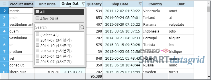
With using autoFilter property of the data column, you can display only the values not duplicated among those contained in the column, and only the data rows corresponding to the selected value. And, it can be used in combination with the existing Column Filter.
Selection Display
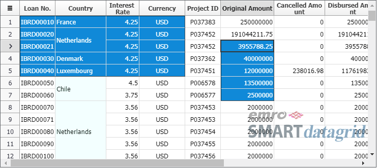
If specify DisplayOptions.selectDisplay as CELL, it will display the selection state by each cell with using GridStyles.selectedBackground and selectedColor, instead of displaying the data cell area with an opaque mask.
Mask Editor
If use MaskCellEditor, you can limit user input format in several ways, including run time. (Testing)
Async Exporting
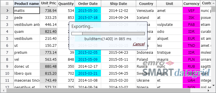
It may need a long time to convert large amount of grid data to an excel file depending on the system performance. JavaScript UI runs on a single thread, so it will stop working if excel exporting operation takes a long time.
In order to respond to this problem, SMART datagrid enables to export an excel file in the asynchronous style.
Tooltips
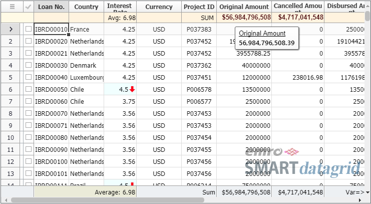
Including the data cell, if the mouse has been over the header, footer and summary cells for a period of time, a tooltip will be displayed. And, you can customize the contents to be displayed in the tooltip with html.
List Editor Two Values
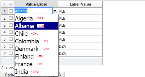
In the dropdown list box of the list editor, two corresponding values each for values and labels can be displayed together, or either of them can be displayed. You can specify how to display them through ListCellEditor.listItemDisplay property.
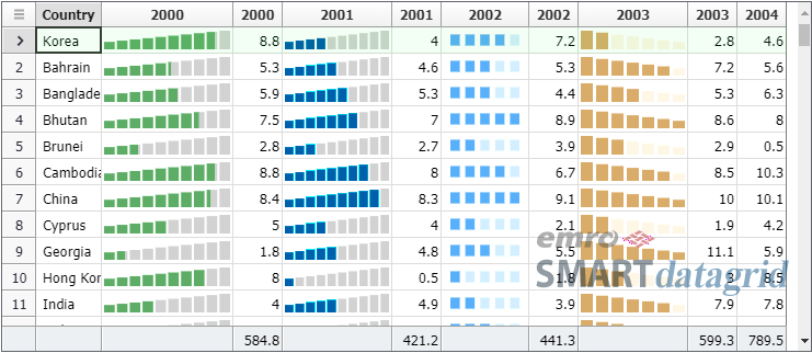
Spark Chart Renderers
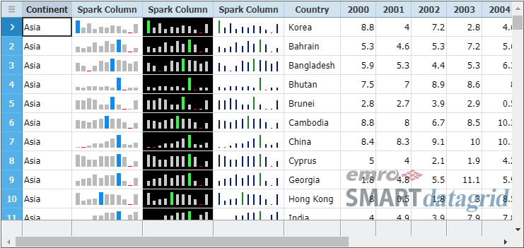
SeriesColumn displays one or more related field values at the same time. Several values, including the change of the values of each time or the comparison of the values of each group, can be checked by one visual pattern.
Undo & Redo
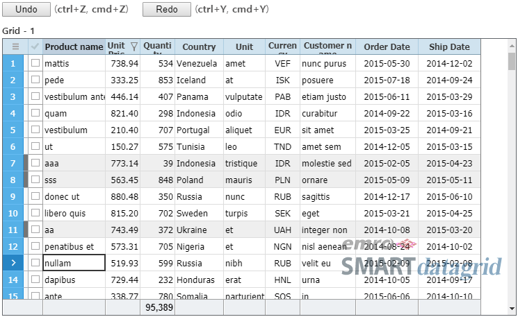
Like a common document editing application, SMART datagrid provides the function of Undoing and Redoing user input or data set modification step by step.
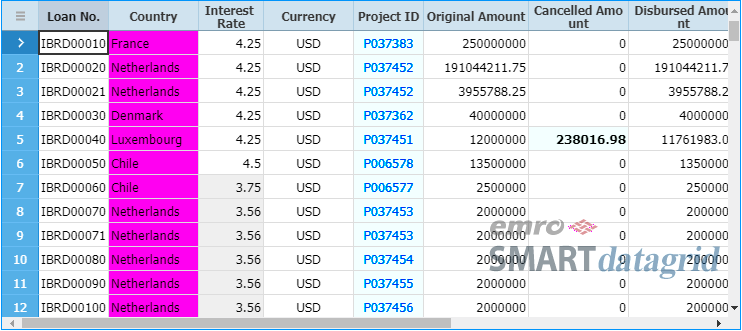
Total Calculated Columns
Calculated Columns specified by cached keep and reuse the calculated values to improve performance whenever it is necessary.
At this point, if the calculation area is expanded to the grid or row group level, the values with a special purpose can be displayed in the calculated column cell.
Derived Field & Row Tag
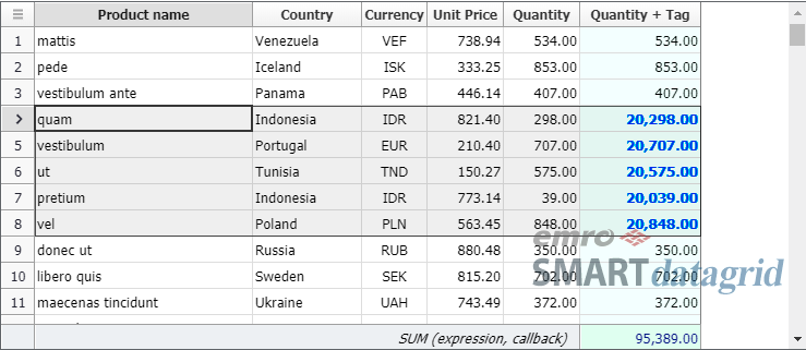
If apply Data Tag to Derived Field, different aspects of the data set can be displayed dynamically during run time without changing the source data. tag variable can be used in the Expression of the derived field, and it is a value configured through DataSet.setRowTag, etc.
Row Heights
If the column group of vertical layout which has two or more child columns is not included, and if specify variableRowHeight as true, the height of each data row can be differentiated individually.
Scroll Bar
The width, start position, button start position of the grid scroll bar can be specified in different ways. And, the style of each element can be specified separately. These properties can be specified through GridBase.vscrollBar and hscrollBar which are the object properties of ScrollBar.
SignalBar Cell Renderer
Display the value of the data cell and the rate of the range of minimum and maximum with the number of discrete barCount of the signal bar which shows the signal intensity. Since it is displayed by the number of signal bars, it can be used to display the value of each stage rather than an exact value.
Image Cell Renderer
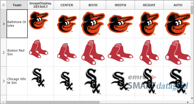
ImageCellRenderer loads and draws the image in the URL which is stored in the cell value. If the cell value does not have the full path, valueCallback of Calculated Column can be used to create it dynamically.
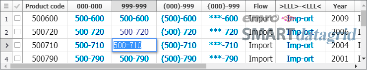
Column Cell Merging
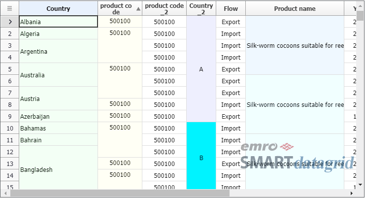
You can display after merging one or more neighbor cells which are belonging to the same column. The criteria of merging the cells is the result value of the expression specified in ValueColumn.mergeExpression property. In other words, if the value of the cell is the same as the one of the prior cell after calculating with the expression, these two cells will be displayed after merging. If SMART datagrid expressions are not enough, you can specify JavaScript callback function in mergeCallback property.
Shape Cell Renderer
ShapeCellRenderer displays the shape specified as GridStyles.shapeName in the location specified as shapeLocation. The default value is LEFT_SIDE. The shape can be displayed in different ways with using the style like shapeRotate and the properties of the renderer like scaleX. Please refer to ShapeCellRenderer help topic about the displayable types of shape.
Column Headers
Besides the basic header text, sub text, image icon, check box, menu handle can also be displayed in the Column Header.
- Hello Grid
- Explain the most basic process of creating and connecting Data Set and Grid.
- Column Grouping
- Various column layouts can be configured with using Column Groups.
- Focused Cell
- Explain the meaning of data cell location, the way to specify focused data cell location and the location change event.
- Column Footer
- The example of displaying Footer and the statistical value of each column in the corresponding footer.
- Column Footer Callback
- The example of displaying the statistical value of each column in Footer with using callback functions.
- Column Sorting
- Learn about Column Data Sorting.
- Column Filtering
- Learn about Column Filtering.
- Column Styles
- Set and change Column Styles.
- Excel Exporting
- The example of exporting the contents of Grid to an Excel file.
- Dynamic Style Exporting
- The example of exporting the dynamic styles set in the columns or rows to an Excel file.
- Cell Renderers
- Learn about the concept of the data cell renderer and how to use it.
- Column Dynamic Styles
- Learn about how to dynamically specify the cell renderer of drawing the data cell.
- Dynamic Cell Renderer
- The example of specifying the cell style differently depending on the cell value or the row state with using dynamic style.
- Fixed Columns
- Learn about how to set Fixed Columns and the related properties.
- Series Column
- The example of using SeriesColumn.
- Load CSV Data
- The example of importing Csv Data to the rows of the grid data set.
- Load JSON Data
- The example of importing Json Data to the rows of the grid data set.
- Load XML Data
- The example of importing XML Data to the rows of the grid data set.
- Lazy Data Loading
- The example of importing the entire data set by diving it into several parts rather than all at once.
- Set Data Rows
- The example of filling the initial rows of the data set by calling API.
- Data Process in Grid Data Set
- Learn about the basic data process of GridDataSet which is connected to GridView.
- Import Data from Grid Data Set
- Learn about how to import the data of GridDataSet which is connected to GridView.
- Set Row Count
- Change the number of rows of GridDataSet without calling the row additionally.
- Search Row
- Learn about how to search the row which is meeting the specified conditions.
- Grid Header
- Learn about the properties of GridHeader.
- Grid Footer
- Learn about the properties of GridFooter.
- Grid Header Summary
- Learn about the properties of HeaderSummary.
- Row Indicator
- Learn about the properties of RowIndicator.
- Data Row State
- Learn about the contents related to the state of the data row.
- Checkable Expression & Callback
- You can control the rows of which checked state can be changed by the user through expression and callback function.
- ScrollBars
- Learn about how to place ScrollBar, etc.
- Row Hovering Mask
- Learn about how to display Row Hovering Mask.
- Fixed Rows
- Learn about how to set Fixed Rows and the related properties.
- Column Cell Merging
- The example of displaying after merging the data cells with the standard of the value, etc.
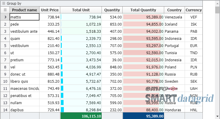
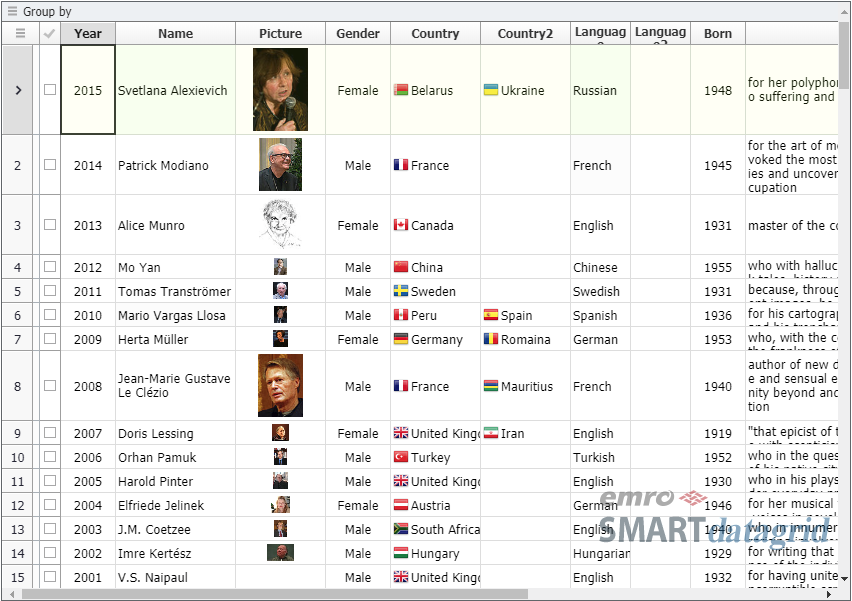
- Row Grouping
- Learn about how to do grouping by field values which have specified Data Rows.
- Merged Row Grouping
- Learn about how to do Row Grouping through merging cells.
- Row Group Levels
- Learn about how to specify the properties and styles by each Row Group Level.
- Selection
- Learn about how to select the data cell area in different forms.
- Bar Cell Renderer
- Learn about how to use Bar Cell Renderer.
- Cell Editing
- Learn about the basic information about Cell Editing.
- ReadOnly & Editable
- Learn about how to specify whether to edit or modify the cell.
- Row Updating
- Learn about how to modify the existing row through user editing.
- Row Inserting
- Learn about how to add a row through user editing.
- Row Deleting
- Learn about how to delete a row through user editing.
- Boolean Value
- Learn about how to save Boolean field value in the data set and display in the data cell.
- Number Value
- Learn about how to save Number field value in the data set and display in the data cell.
- Datetime Value
- Learn about how to save Datetime field value in the data set and display in the data cell.
- Link Cell Renderer
- Learn about how to use Link Cell Renderer.
- Check Cell Renderer
- Learn about how to use Check Cell Renderer.
- Data Lookup
- Learn about how to display the data cell value with using Lookup function.
- Label Field
- Learn about how to display another field value rather than the original field value with using LabelField.
- Cell Styles
- Learn how to specify the style of each data cell with using CellStyle.
- ColumnLayouts
- Learn about how to change the column layouts with using ColumnLayout.
- Context Menu
- Learn about how to replace Context Menu of the browser.
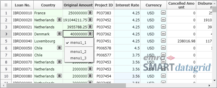
- Column Popup Menu
- The example of adding the popup menu in data column.
- Paging
- Learn about the simplest way of paging.
- Paging Data
- Learn about how to load the necessary data when modify the page.
- Paging Offset
- Learn about how to differently specify the location of the rows to be displayed in the page.
- Paging Rows
- Learn about how to explicitly specify the rows to be displayed in the page.
- Icon Cell Renderer
- Learn about how to use Icon Cell Renderer.
- Image Cell Renderer
- Learn about how to use Image Cell Renderer.
- Shape Cell Renderer
- Learn about how to use Shape Cell Renderer.
- Signal Bar Cell Renderer
- Learn about how to use Signal Bar Cell Renderer.
- Barcode Cell Renderer
- Learn about how to use Barcode Cell Renderer.
- Spark Chart Renderers
- Learn about Spark Charts which can be used in the series column cell.
- Toast View
- The example of displaying Toast View when calling a function running a long time.
- Edit Keys
- Learn about the key input used in cell-to-cell transfer or cell editing.
- Cell Validation
- Learn about how to run cell-based validation during editing.
- Row Validation
- Learn about how to run row-based validation after editing.
- Text Editors
- Learn about the editors used to input the text.
- List Editors
- Learn about the editors expanding the dropdown list box in which are included the selection items.
- Display Two Values in Dropdown List
- Learn about how to display two values in dropdown list.
- Date Editor
- Learn about the editor used to input the date.
- Dynamic Editor
- Different editors can be used in each data row.
- Hello Tree
- The basic process of creating and connecting Tree View and Tree Data Set.
- Tree Data Set
- Learn about the basic functions of TreeDataSet.
- Load Tree Data Set
- The example of loading the tree data from external data source of different types.
- Lazy Load Tree Data Set
- The example of loading the child rows when they are needed.
- Tree View Filtering
- Apply Column Filter in the Tree View.
- Tree View Row Filtering
- Apply Row Filter in the Tree View.
- Tree View Editing
- Learn about how the user modifies the data in the Tree View.
- Tree Row Footer
- Learn about how to display Footer in each Tree Row.
- Clipboard Copy
- Learn about how to copy the data cell area to the system clipboard.
- Clipboard Paste
- Learn about how to copy the clipboard text to the data cell area.
- Undo & Redo
- Undo and Redo.
- Row Styles
- Learn about how to apply the styles to the data row.
- Alternate Row Colors
- Learn about how to alternate background colors of the Grid Row.
- Shared Grid Data Set
- Learn about how multiple grids share the data set.
- Shared Grid Row Source
- Learn about how multiple grids share Row Source.
- Hello Animation
- Use Circle Gauge Renderer to run animation effects when the data is changed.
- Linear Gauge Renderer
- The example of using Linear Gauge Renderer.
- Hello Chart
- Display one or more corresponding field values in a chart to show the data set more effectively.
- Row Group Chart
- Learn about how to display a chart in a Merged Cell which has done Row Grouping.
- Group Footer Chart
- Display the values of Group Rows in the Footer area of each group which has done Row Grouping in a chart.
- Group Header Chart
- Display the values of Group Rows in the Header area of each group which has done Row Grouping in a chart.
- Tree Footer Chart
- Display a chart composed of the values of the child rows in Footer area of each Tree View Level.
- Tree Header Chart
- Display a chart composed of the values of the child rows in Header area of each Tree View Level.
- Derived Fields
- Learn about the basic operations of Derived Field.
- Calculated Columns
- Learn about the basic operations of Calculated Columns.
- Row Summary
- Learn about how to display the total of each row with using Derived Field or Calculated Column.
- Delegate Columns
- Learn about how to specify the column representing Column Group.
- Column Header Summary
- Display the column totals in Header Summary area.
- Column Headers
- Learn about how to decorate Column Header.
- Load Styles
- The example of applying Grid Style Sheet set in a separate object.
- Search Tree Row
- Learn about how to search the row meeting the conditions specified in Tree View.
- Data Cell Buttons
- Set Menu Button and Action Button in each Data cell.